With this in mind it was important to our whole team that we not only build a museum that achieves this but that we also do this by including young adults aged 15+ in the design process. After all, MOD. is their place.
How we are designing with young adults
My background is in human centered design, specifically in the context of digital service and customer experience design in government and utility industries. At first glance, this might seem a world away from designing a museum for young people, however the UX methodologies I applied in those contexts have proved to be a very useful model for tackling the design of a physical museum experience as well. Critical to this has been about giving young people an empowered role in helping to shape what will eventually become MOD.
As a team, we have been doing this in several different ways:
- Through the engagement program with schools and students our Director, Kristin Alford, ran last year to inform the strategy and vision for MOD.
- With our MOD. Youth Advisory Board who joined us in August, and supported by Leanne, who will use their specialist skills and technical expertise to guide us on diversity and inclusion, check our ideas and let us know if what we are designing is working for them.
- Through special workshops and programs we are piloting in the lead up to the launch of MOD. and in collaboration with our partners. These include our special design studios for 15–25s as part of this year’s Hybrid World and Open State.
- By using a range of design tools like personas, journey mapping, surveys and user testing to guide our internal design processes. We’re validating as much as we can with young adults and are encouraging them to provide feedback and challenge our thinking as part of this process
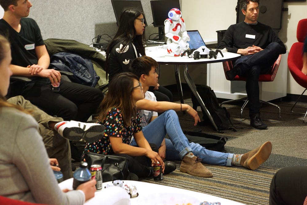
- Through our monthly MOD. CoLAB workshops with young people. We started these in July as an informal way to sense-check ideas and invite young adults to co-create MOD. We’ve backed these qualitative workshops with online surveys to check themes against a larger population size.
What we’ve learnt so far
We’ve been exploring a range of different themes with young people — a lot of what we have learnt has surprised us and challenged our thinking in really interesting ways. Here are five early insights and how we are beginning to apply them in the design of MOD.
1.What makes a museum or gallery experience great for young adults is pretty universal
In all the conversations we’ve had, and the surveys we’ve done, the ways people describe their best experiences at museums are galleries are often the same. The two words that come up time and time again are “immersive” and “interactive”:
“Bowie at ACMI in Melbourne. It was a supremely immersive experience, brilliantly displayed, well thought out, and true to the essence of the material.”*
“I like ones that are interactive, fun and bright. Also anything with food or things to keep is good.” *
People also often talk about the emotional impact the experience had on them as the reason why it was so meaningful. Other words that are often repeated are ‘beautiful’, ‘visual’, ‘memorable’, ‘personal’, ‘interesting’ and ‘easy to understand’.
2. They are sceptical of museums, especially those pitched at them
The young adults we have spoken to expect a lot from MOD. There is nothing really like it in South Australia at the moment and they want it to delight them. When we asked them what we could do that ‘would disappoint them’ them when we open they repeatedly told us that ‘old tech’, ‘boring content’ (read: stuff they have seen before) or content pitched at the wrong age group were there biggest turn-offs. As a result, we know we need to stick to our design principle of being unexpected and audacious (and we really need to make sure the tech works).
“I love technology, so nothing would disappoint me unless it was outdated information”*
“Plasma globes. They are very boring.”*
“Same old exhibits that are found in every museum”*
3.Museums seem to win over art galleries and science centers
We ran an online survey earlier this year in which we asked people to describe the best exhibit they had seen and where they had seen it. Most picked something from a museum. This supports the discussions we’ve had with young adults who have attended our CoLAB sessions. Further, these percentage splits seem to be consistent across all age groups. The wonderful MONA and ACMI were the two Australian examples most often referenced as people’s favorite experiences.

4.Young adults favor functionality over the latest technology (and they are not that keen on apps)
When we first started thinking about MOD. we were pretty sure we needed a dedicated app to support visitor experience. We’ve now scrapped that idea. This is both because we believe the future of technology is not about devices and more about embedded technology and also because young adults told us they didn’t really want it.
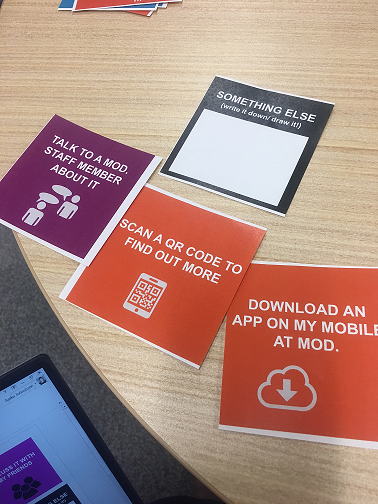
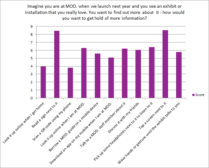
We ran a card sorting exercise with a CoLAB group earlier this year to try and better understand how they want to access information inside MOD. and then backed this up with a survey. Traditional ways of consuming content within a museum (signs and screens), still came out on top. This surprised us, however the reasons they gave made a lot of sense. They told us that apps cause big problems due to data capacity even where the wifi is great — they are also not keen on downloading them for a once-off experience. Activities that draw attention, for example waving hands to trigger a motion detector, make them feel conspicuous (see below) and were also problematic. So was anything that involved multiple steps (QR codes or accessing from a website back at home). Mostly they told us that they want to be able to navigate the space on their own terms in their own time and reading plain English, short text descriptions was best (and easiest) for that.
5.Young adults don’t want to be conspicuous
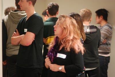
One of the most significant insights is that young adults are often concerned about feeling conspicuous. This came up multiple times in our CoLab group and in conversations with young people and creates a diverse range of barriers. These are just some of the insights we have discovered:
They don’t really want to have to ask for help. This applied to everything from fears about arriving at MOD. and not being sure where to go, right through to asking for help about how to interact with an exhibit. They are more comfortable asking questions or interacting with staff after they have been given enough information to be able to choose their own path and approach. As a result, we’re now thinking about ways we can remove some ambiguity to better provide visitors with enough information to help them self-guide their experience (without being prescriptive).
Moderators can be intimidating. Some young adults have told us they are worried about approaching moderators if “they are too good looking” or if they feel like they don’t know anything and could be made to “look stupid” (when I heard this I immediately remembered my own shyness as a teenager and though “yep — that was definitely me’). As a result we are now thinking more strategically about where we will place our moderators, the training we will give them and the activities we will get them to do so that they don’t turn young people off.
Activities that draw attention can be turn-offs. They told us they don’t like using headphones or other devices where they feel like they might be holding others up or doing activities in public where others might be watching them. This one is trickier for us as our exhibits will be sometimes like this! We are however, making sure as a result that we are creating experiences that appeal to those who don’t want to stand out too including contemplative and quiet areas across our first two exhibitions.
What we plan to do next
While we have been co-creating MOD. with young adults we have also been using this process to better understand what sort of engagement works for them. We haven’t quite cracked it yet. Our events have been really useful and we’ve had great feedback from everyone who has attended, however it remains challenging to reach young adults and so numbers, for both workshops and surveys, remain small. We suspect this is due to range of complex factors including study schedules, lingering confusion around MOD. and what we are trying to do, shyness and the potential for conspicuousness (again, see above) and so many other events competing for their attention. As a result, we know we need to continue to refine our approach and find, and test, new ways of doing things.
Because of this, the insights above represent a set of emerging themes rather than a definitive design agenda. They are beginning to shape both our thinking and the design of MOD. but we want to keep checking back in to make sure they remain relevant for the audience we are designing for.
If you are a young adult, aged 15–25 who would like to contribute to the design of MOD., we’d really love to hear from you! You can get in touch, and see what events are coming up, on our website mod.org.au.
*(anonymous respondents, MOD. design survey, August 2017)

