Posted 8 Nov

MOD. has a set of design principles that guide our work. We keep these in mind in exhibition design and make sure we are heading in the right direction. Some of them sit as a reminder of our vision as an institution. Think Two Way Mindedness – incorporating Aboriginal ways of knowing and science into the topics we cover. Or there’s Connected to Research and Enterprise, sharing research happening within UniSA, or across Australia. These design principles have served us well so far, but recently we have made a couple of changes.
We have reframed our design principle of Scaleable to For One and Many. This shifts the emphasis to what we really want to do. We want people to be able to explore alone, to take things in and mull over the content. But we also want people to come with friends, or to create connections between visitors who don’t otherwise know each other.
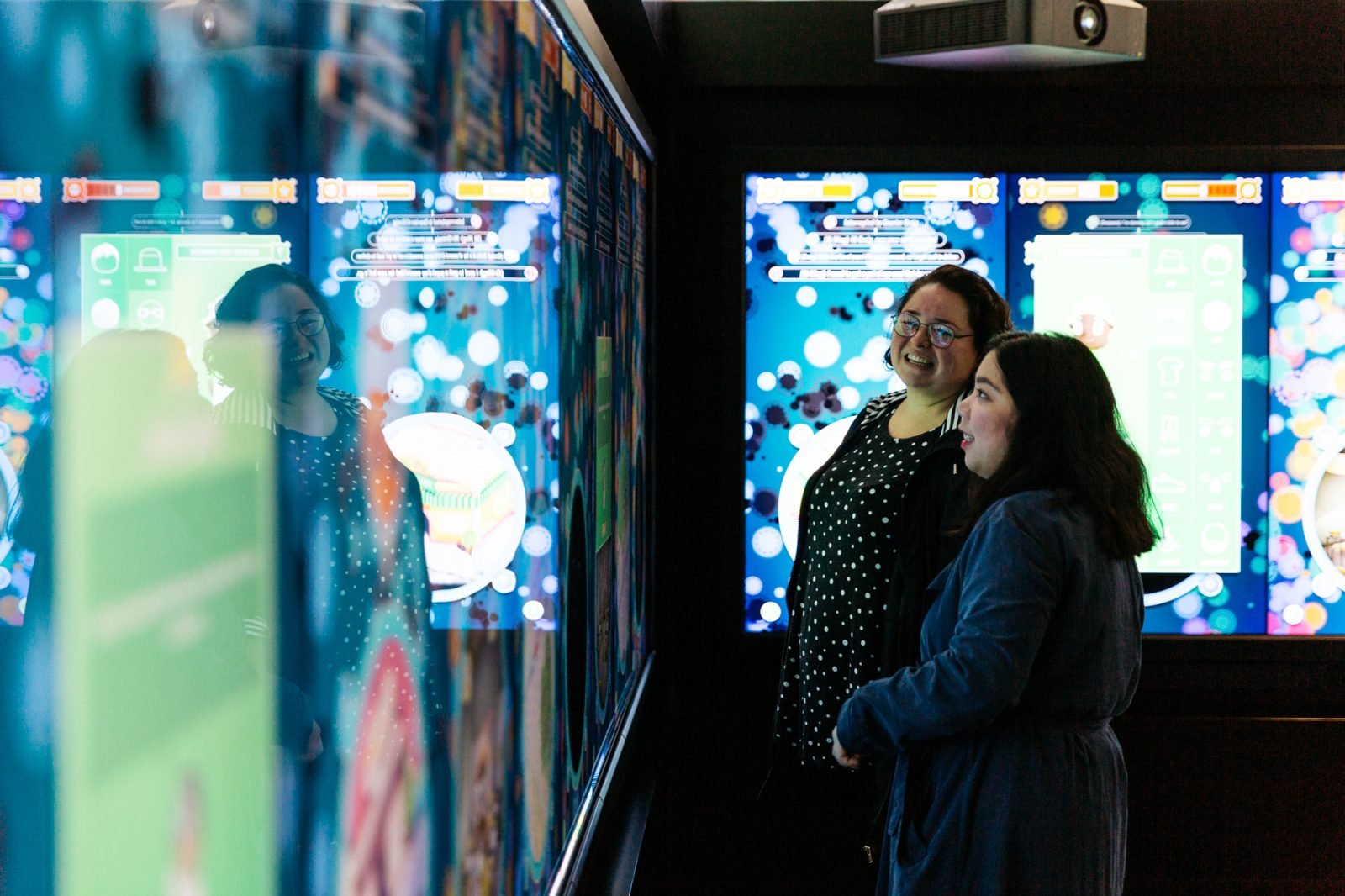
This design principle is easily seen in our recent exhibit, Symbiosville, pictured above. Symbiosville is a touch screen game we developed in collaboration with QUT. It looks at the microbiome, the millions of bacteria living on us and in us, and how to make them happy. The game was set up in the Universal Gallery. Visitors could play alone or in groups, each person either controlling their own character or taking turns sharing.
During our user testing, this went pretty well. The testers played individually, but talked constantly and pointed out tips for the game. This has been replicated in practice. Groups of friends or families come in to play, or else solo visitors play alone. Recently a Moderator spotted two strangers playing together. It’s exactly what we wanted to see.
We have also created a new design principle: Sustainable for Life. It’s important to keep adaptive re-use at the top of our mind, always. MOD. is not a collecting institution, but wow have we collected a lot of stuff. This re-use is something that we have been doing since MOD.’s inception. It’s important that our actions match our words, that we think of ways to recycle and re-use what we build.
If you are a loyal MOD. visitor, there are some things that you will notice popping up again. Our trusty Bose sound chairs first featured as part of Sit Down With… in MOD.IFY. They re-appeared in the Cosmic Living Room, and now in HEDONISM we are using them for our VR artworks in the Pleasure Arcade 5000.

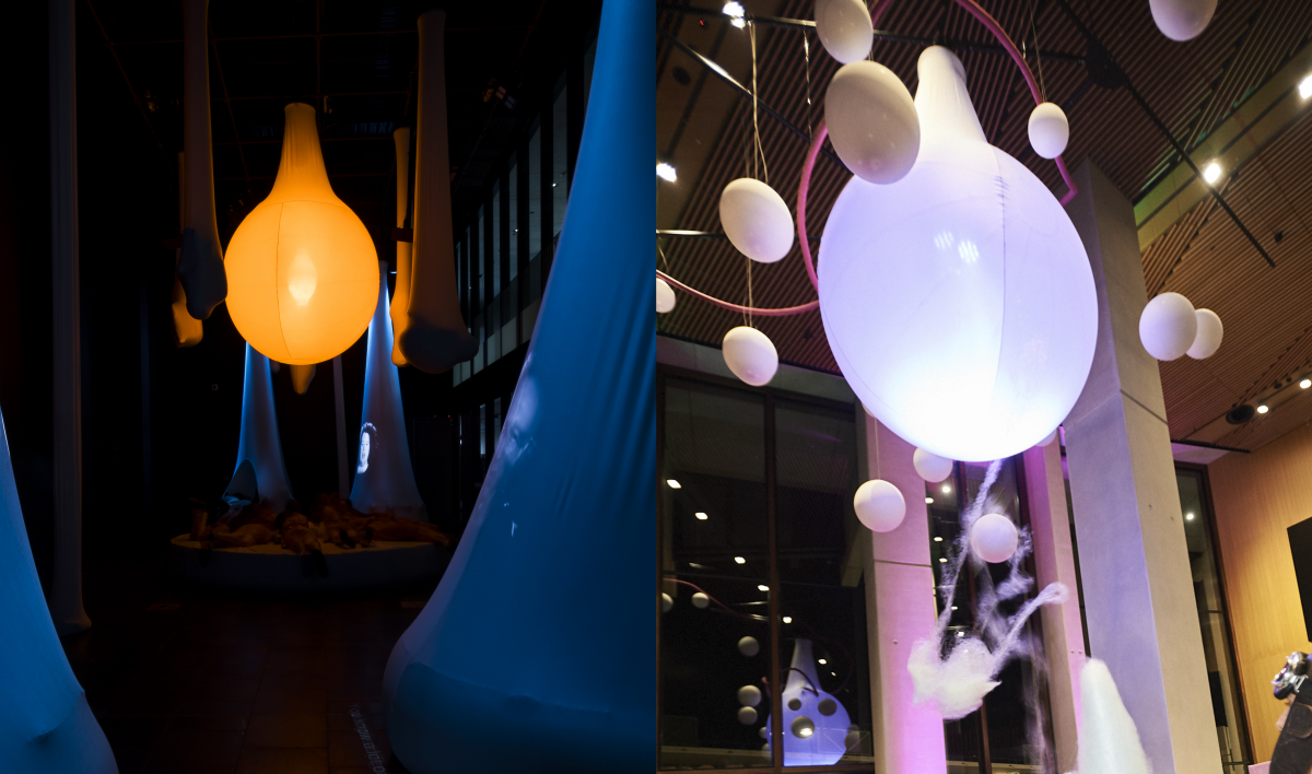
The sun from Sleep Ops has been re-purposed as our Hedonometer in HEDONISM, changing colour every 30 seconds as the mood of Australian Twitter changes.
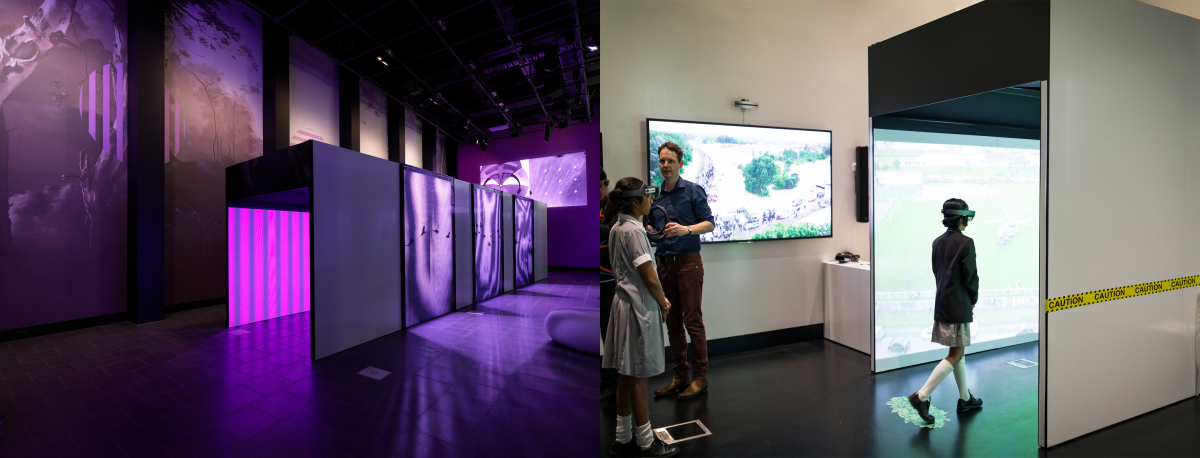
Or maybe you’ve noticed the tunnel from Birds and Bees made a re-appearance in Augmented Relief, but is missing in HEDONISM. Let’s just say you’ll have to wait to spot it in the upcoming SEVEN SIBLINGS FROM THE FUTURE.

These new design principles sit well. They are things we have been thinking about for awhile in the exhibitions team, but have never properly articulated. It feels good to formalise them, making sure that we keep them top of mind. The really great thing when you build a museum from scratch is that you can change things when they don’t work. We don’t have years of history, and it’s actually quite freeing.
If you’re interested in reading some more about the other principles we use to guide our practice, check them out here.