Posted 3 Jul
As an Exhibitions Coordinator here at MOD. I take exhibitions from design all the way through to operations. This new Behind the Scenes series will be notes from me, talking about some of the processes we have here at MOD. and how we bring our exhibits to life.
HEDONISM is our third exhibition and launched at the end of May. HEDONISM aims to re-frame the concept of hedonism by looking at ways that we can experience lifelong pleasure. I wanted to share what it looks like to go through the design process of one of our galleries, Connect For, from inception all the way through to delivery.
We have used a few different approaches to design galleries over our first three exhibitions. Some have come from open call out, with researchers and artists pitching us ideas for what they think we should include. We have had some artist commissions, where we have worked with an artist to realise an idea. And finally, we have worked with researchers to find an engaging way to display their research. This last approach is the one we used to develop Connect For.
One of our key design principles is being Connected to Research and Enterprise, which basically means we take current research and bring it to life for our visitors, making it accessible and relevant to their lives.
As a museum housed in the University of South Australia, we often take research happening on one of our campuses. In the case of Connect For, we also worked with researchers across South Australia. We wanted to look at social connection very broadly and its importance in pleasure and wellbeing. It turns out there is a lot of research in this area at the moment, and after initial discussions we focused on four projects:
All of this research had a common thread of the importance of social connection. We had our gallery theme sorted.
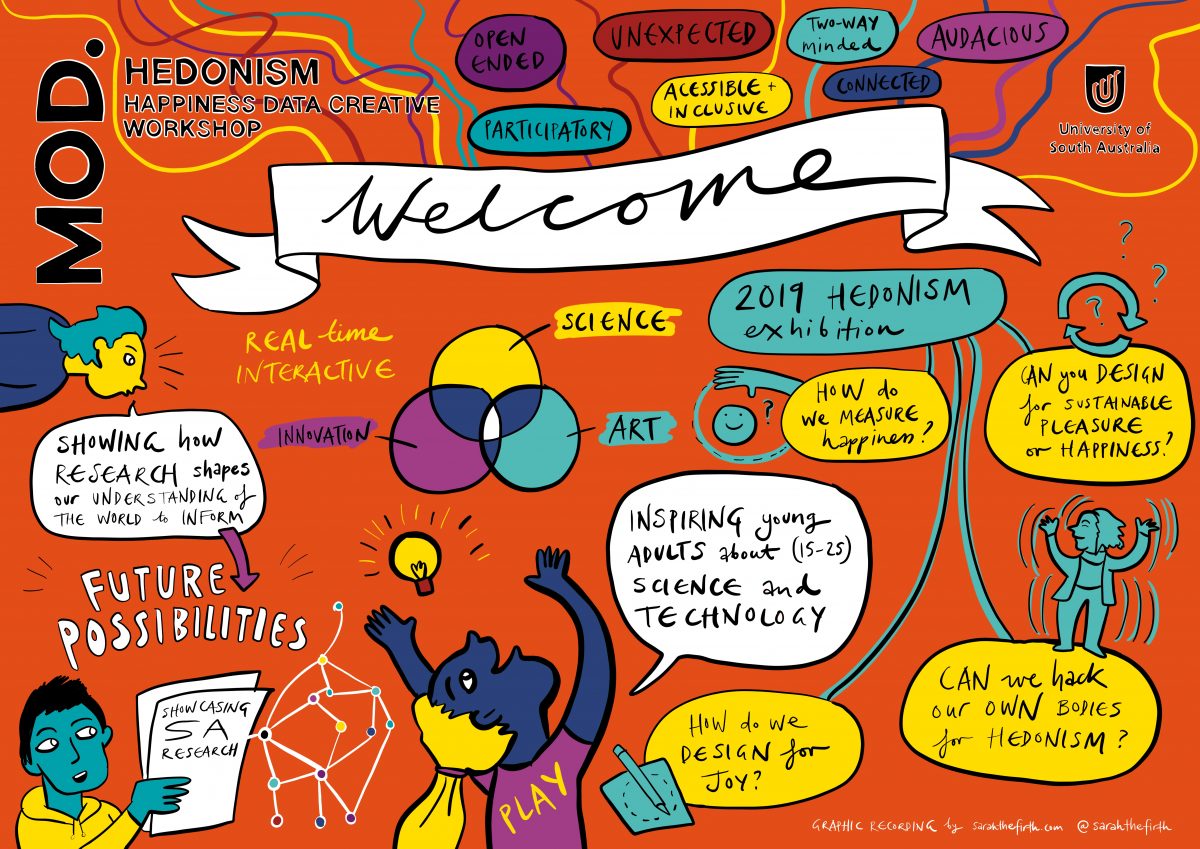
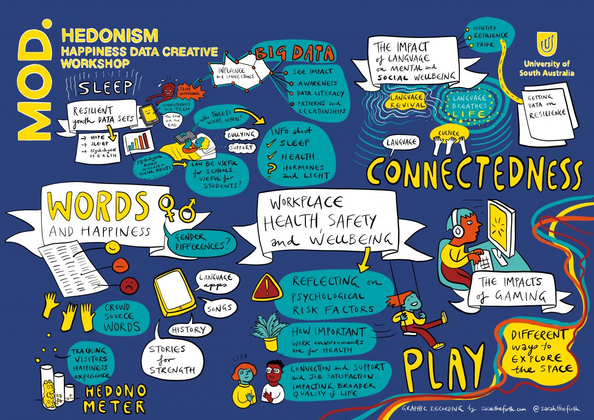
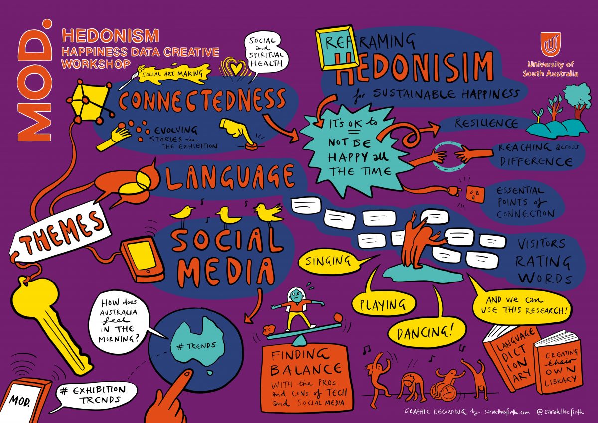
Now, the big one. What did we actually want out of the gallery? We decided the best way to figure it out would be to run a creative workshop with the MOD. design team and the researchers. It enabled us to work through some problems and re-consider what exactly we wanted to focus on. We also invited Sarah Firth to come along. Sarah is a graphic recorder and produced these excellent illustrations which summarise our conversations.
From here, we were able to put together a creative brief and send it off to a number of suppliers.
We decided to work with Exhibition Studios on the design of the gallery because we really liked their ideas. They had thought about how to connect the thread of social connection between each of the exhibits (and they did so with a literal pink thread motif) and they had strong ideas for data visualisation.
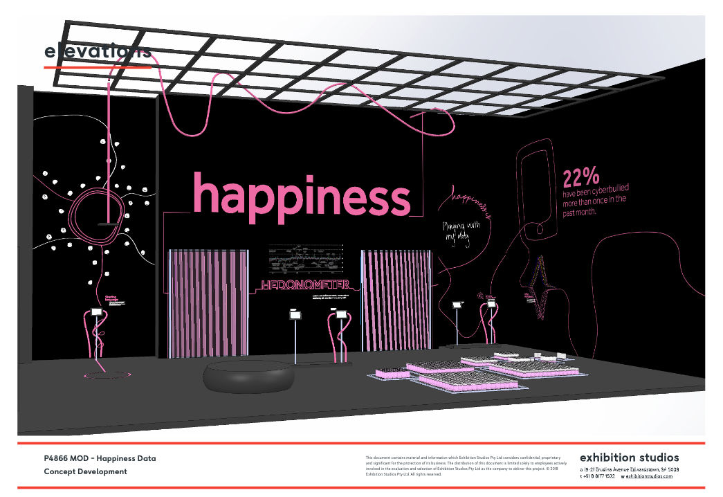
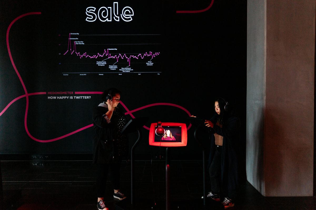
This is one of their early designs. There are some things that stayed consistent from this first early concept. Namely, the display of the Barngarla language project, the Hedonometer, and the animations of the Youth Resilience data. But there are a couple of really big changes.
The biggest change physically was we planned Connect For to display in the Gould Interactive Gallery, but looking at designs we realised it was perfect for the Lecture Gallery. The Lecture Gallery is a tough one to work with because it is also used as an event space, so physical displays need to be portable. We did a big gallery re-shuffle and repositioned this installation downstairs.
In our first two exhibitions, the Lecture Gallery just had wall displays. In MOD.IFY that was Prosthetic Reality and in WAGING PEACE we had Brand Peace. While Brand Peace was really impactful, it wasn’t as interactive as it could be. We wanted to use the Lecture Gallery space to its full potential.
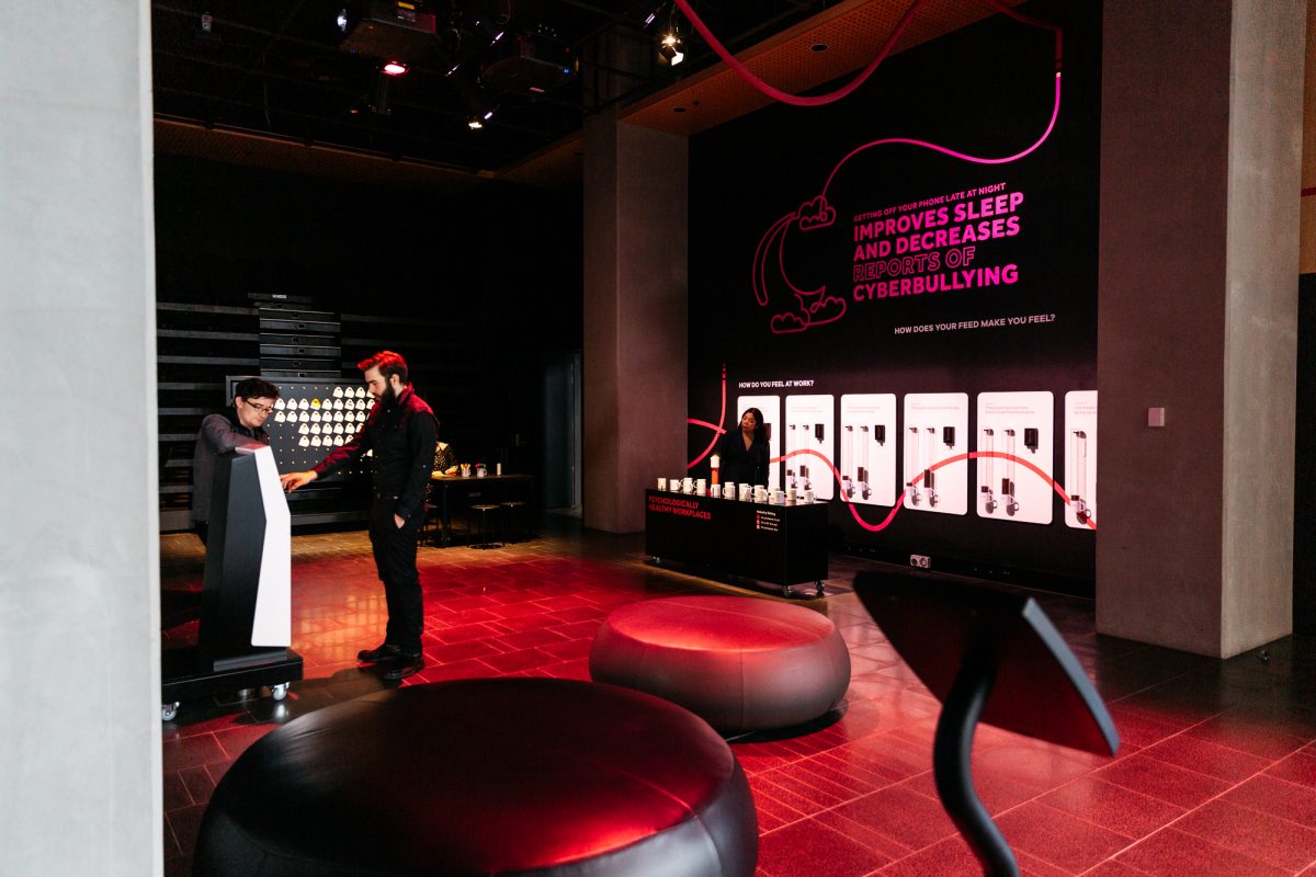
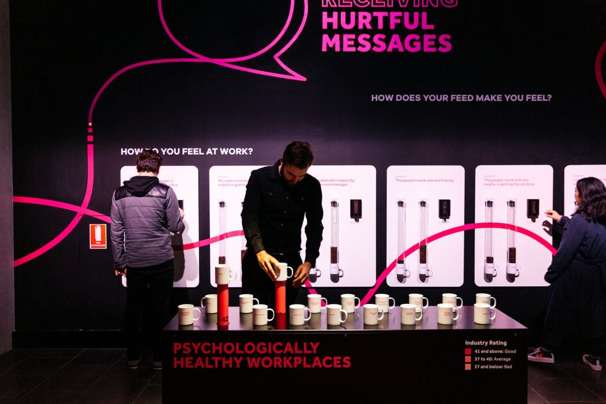
We also wanted to change the way that we were visualising some of the research data surrounding psychologically safe workplaces. The MOD. team had lots of conversations about what we wanted our visitors to take away from the display. We became really conscious of the huge body of research we were working with and it was important that we narrowed down to a clearer focus. But also, we had to think about what could work best for our target audience of young adults.
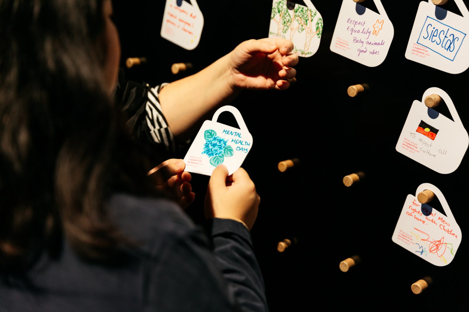
We had talked extensively about ways to engage people with the research using non-digital interactives. This resulted in the coffee cup motif designed by Exhibition Studios. This came from the idea that most people – from construction sites to offices – drinks coffee (or tea) at work. Someone came up with the idea of the voting with coffee beans with questions from Maureen and Ali’s research, as well as the interactive coffee cup bar graph.
We also wanted a way to engage visitors to leave a mark on the space. One of our favourite elements of the gallery is the peg board where we invite people to draw or write their idea of a supportive workplace. Stay tuned for more on that front.
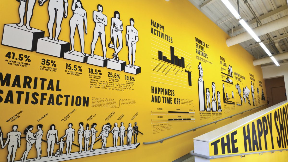
To summarise these very long discussions briefly: data visualisation is tricky! When you’re working with statistics and numbers there are a lot of bad ways to do things. I think we did a pretty good job at finding creative and accessible ways of communicating this research to our visitors.
And finally, the last aspect of the design was naming the exhibit. At the beginning of this whole process we looked at this research as related to wellbeing or supporting happiness. But the more we dug into the data, we realised that it’s actually really unhelpful to think about it in these terms, in particular when it came to naming the gallery. Titles about happiness or wellbeing came across kind of cheesy and they don’t really hit the mark. We ultimately settled on the fact that each of these four bodies of research focus on social connection, be it at home, online, at work, or in your community. And of course we like puns as much as the next person, so we went with Connect For.
We are really happy with the final product and our visitors are engaging with the content. In our user testing period we had some really great feedback from some of the volunteers. Their comments demonstrated that we made some good design choices in our representation of the research and the data. One of the volunteers in particular, Denish, loved this gallery. He really engaged with the safe workplaces research, here’s a quote from him:
For more insight from our visitors on each of the exhibits, check out our HEDONISM exhibit pages under the tab called “Fresh Perspectives”.
A huge thank you to Exhibition Studios for executing the ideas so thoughtfully, and to our gaggle of researchers for sharing such relevant research and their collaboration.